How Linear Regression Works (Visualized Step-by-Step)
Linear Regression is often the first algorithm that newcomers to machine learning learn and for good reason. It’s intuitive, powerful, and forms the foundation for many more advanced techniques.
We’ll visualize every step of how Linear Regression works using Python and Matplotlib.
📌 What is Linear Regression?
At its core, Linear Regression tries to find the best-fitting straight line through a set of points. This line can be used to predict new values.
The equation of a line is:
pythony = mx + b
Where:
mis the slope (weight),bis the intercept (bias).
📊 Step 1: Generate Sample Data
pythonimport numpy as np
import matplotlib.pyplot as plt

# Generate synthetic data
np.random.seed(42)
X = 2 * np.random.rand(100, 1)
y = 4 + 3 * X + np.random.randn(100, 1)

# Visualize it
plt.figure(figsize=(16, 9))
plt.scatter(X, y, alpha=0.7)
plt.title("Generated Data")
plt.xlabel("X")
plt.ylabel("y")
plt.grid(True)
plt.show()
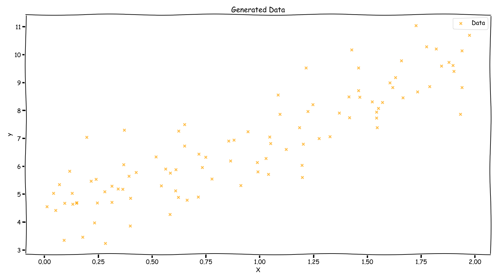 Generated Data
🧠 Step 2: The Goal of Linear Regression
We want to find the best line:
y_pred = m * x + b
such that the line is as close as possible to all points.
But how do we define "closeness"?
📉 Step 3: Loss Function – Mean Squared Error (MSE)
The MSE is the average of squared differences between actual and predicted values.
pythondef mean_squared_error(y_true, y_pred):
    return np.mean((y_true - y_pred) ** 2)
We aim to minimize this MSE.
🔁 Step 4: Gradient Descent (Updating m and b)
We use gradient descent to find optimal m and b.
python# Initialize weights
m, b = 0.0, 0.0
learning_rate = 0.1
n_iterations = 100
n = len(X)

mse_list = []

for _ in range(n_iterations):
    y_pred = m * X + b
    error = y - y_pred

    # Calculate gradients
    m_grad = -2 * np.sum(X * error) / n
    b_grad = -2 * np.sum(error) / n

    # Update parameters
    m -= learning_rate * m_grad
    b -= learning_rate * b_grad

    # Track MSE
    mse = mean_squared_error(y, y_pred)
    mse_list.append(mse)
🧩 Step 5: Plotting the Final Line
python# Final prediction
y_pred = m * X + b

plt.scatter(X, y, label="Data")
plt.plot(X, y_pred, color="red", label="Regression Line")
plt.title("Final Fitted Line")
plt.xlabel("X")
plt.ylabel("y")
plt.legend()
plt.grid(True)
plt.show()
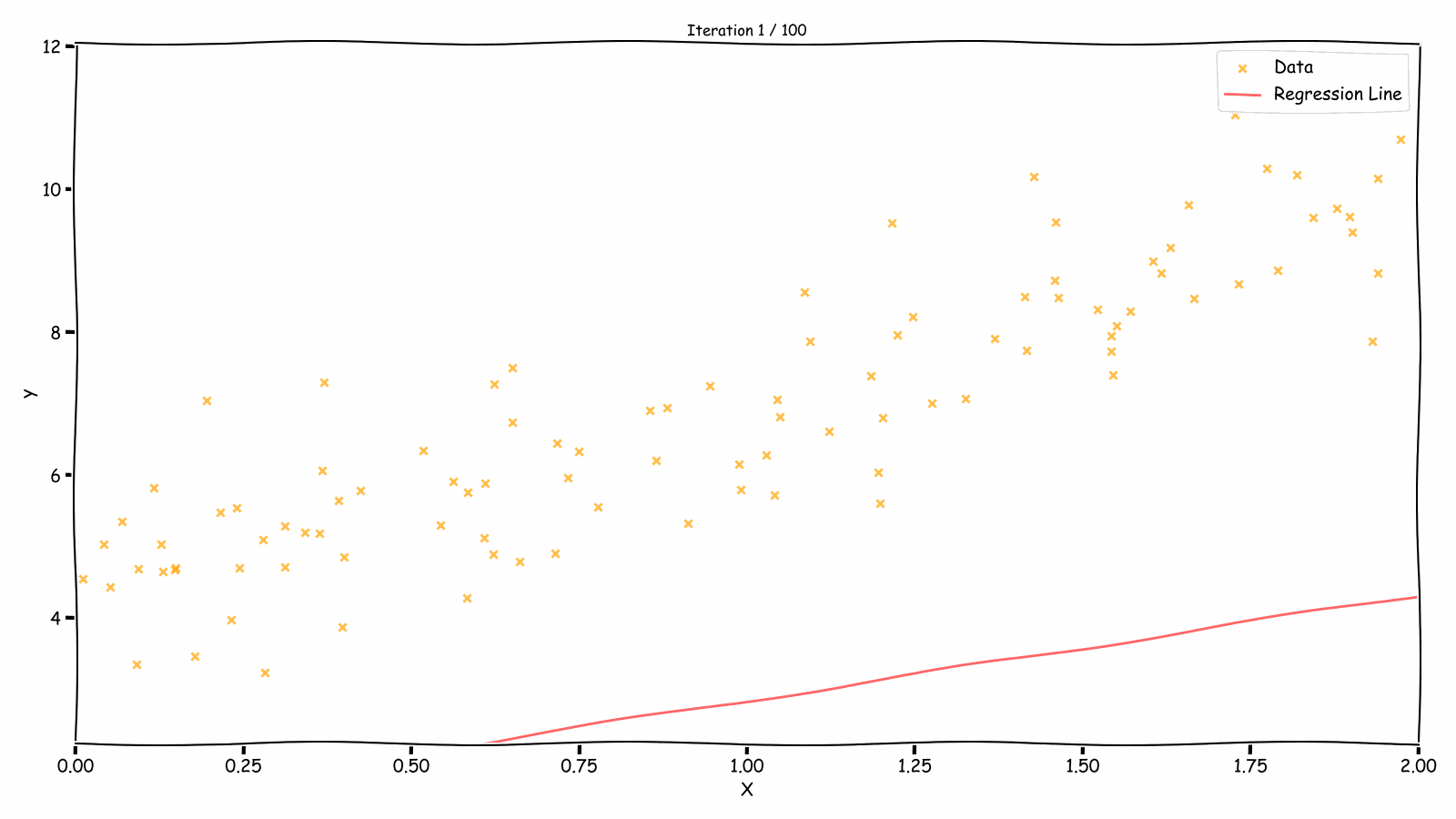 Fitting Over Iterations
📈 Step 6: Visualizing Loss Over Iterations
pythonplt.plot(range(n_iterations), mse_list, color='purple')
plt.title("Loss Over Iterations")
plt.xlabel("Iteration")
plt.ylabel("MSE")
plt.grid(True)
plt.show()
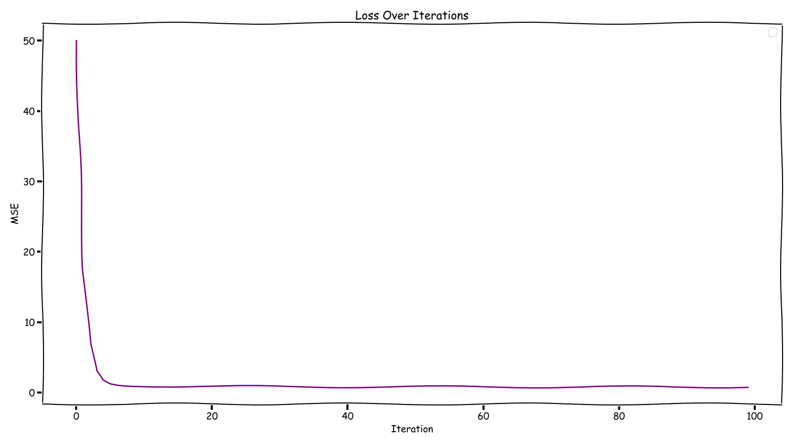 Loss Over Iterations
✅ Conclusion
Linear Regression might be simple, but understanding it visually helps you internalize the ML workflow:
- Define a model
- Use a loss function
- Optimize parameters using gradient descent
- Visualize everything!
This same pattern applies to more complex algorithms too.
Found this article helpful?
Umar Ahmed
Senior Software Engineer & ML Researcher